
At T2, I redesigned the navigation within the community spaces where writers and readers explore their niche.
t2 is a digital publishing app where writers and readers build communities around niche ideas, powered by tools for content ownership, reputation, and monetisation.
As Senior Product Designer, I redesigned the community spaces (Territories) that writers and readersto connect over a shared niche, improving how users navigate content, discover communities, and engage with each other.
As Senior Product Designer, I redesigned the community spaces (Territories) that writers and readersto connect over a shared niche, improving how users navigate content, discover communities, and engage with each other.

PROBLEM
Why the redesign the navigation within the community spaces?
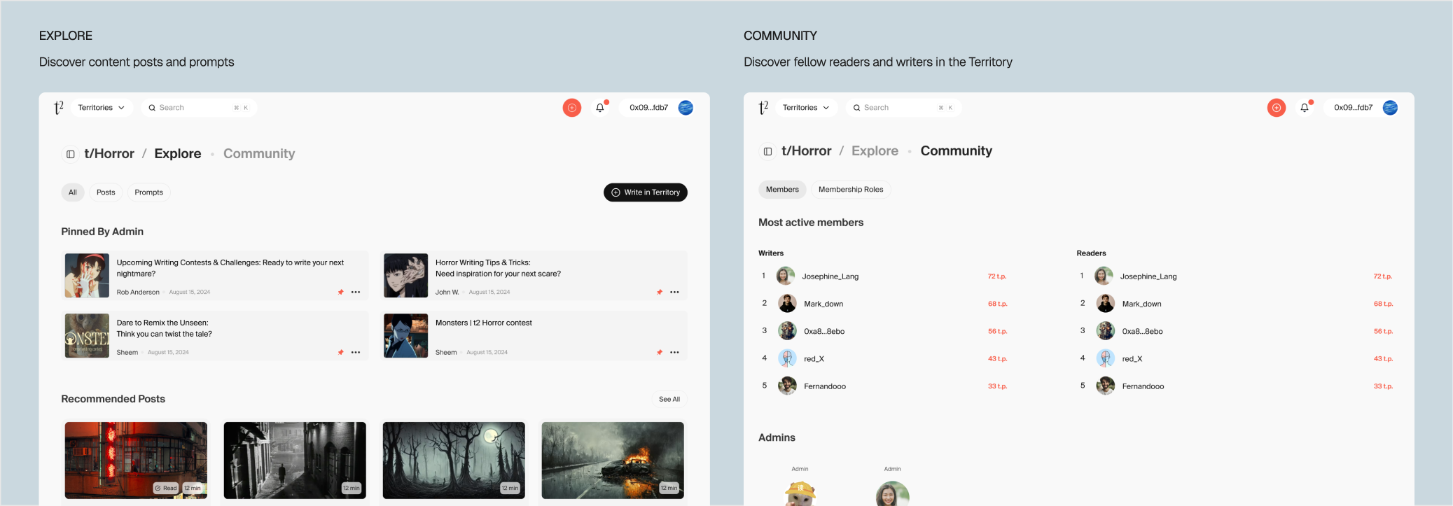
When I joined t2, navigating Territories (the community spaces) felt like a single-column linear page. It features published posts around the shared niche, along with prompts which can be idea starters for posts.
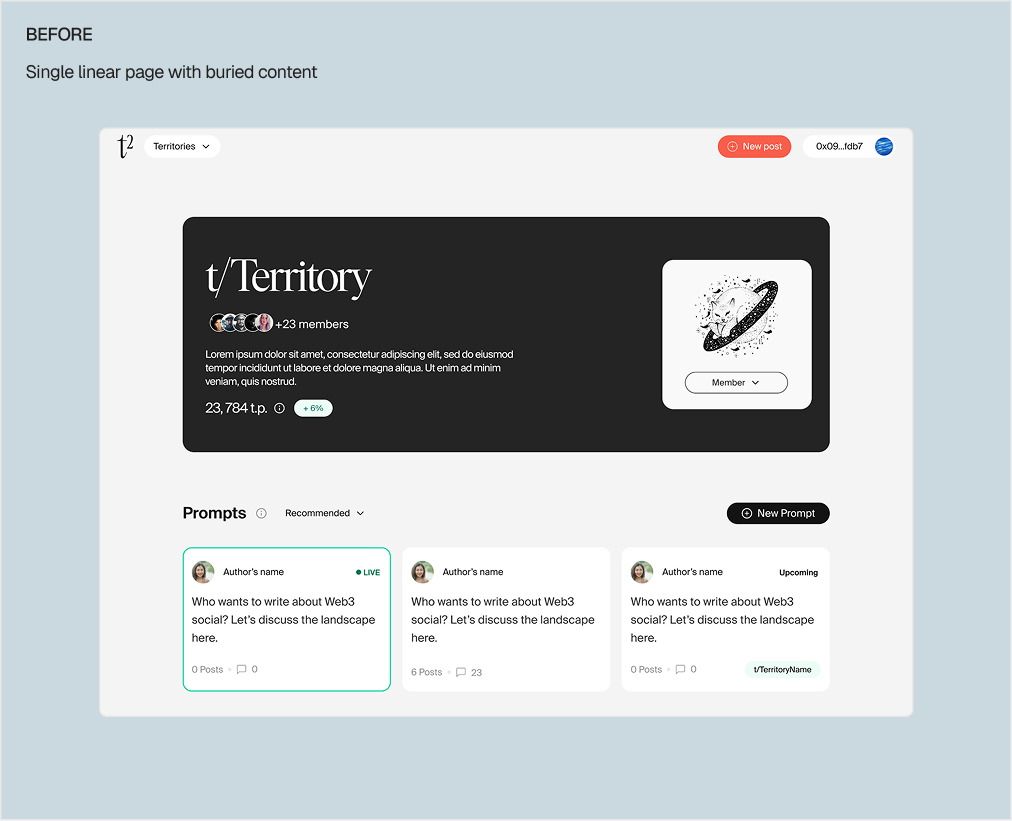
However, as Territories grew with its members, content was now getting buried, it was difficult to find other members, and there was little surface to understand what each community offered.
As t2's roadmap grew, the original layout couldn't hold what was coming.
However, as Territories grew with its members, content was now getting buried, it was difficult to find other members, and there was little surface to understand what each community offered.
As t2's roadmap grew, the original layout couldn't hold what was coming.
OUTCOME 01
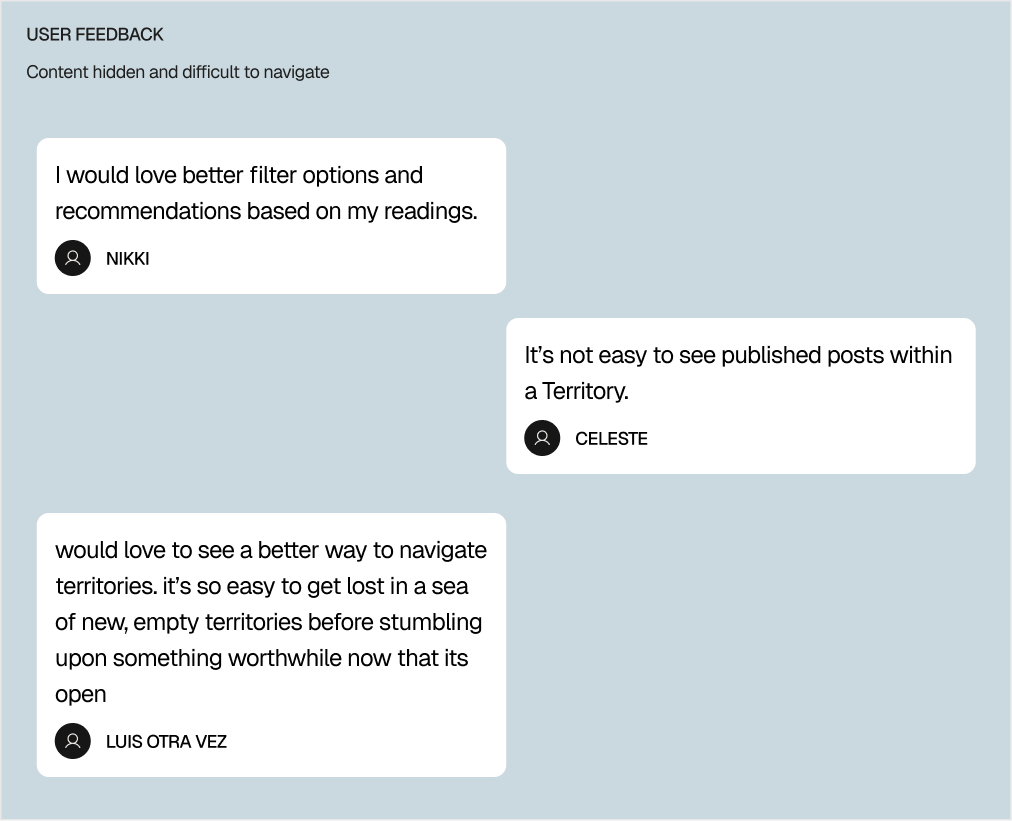
A dynamic layout and tab-based navigation for dedicated content and community features
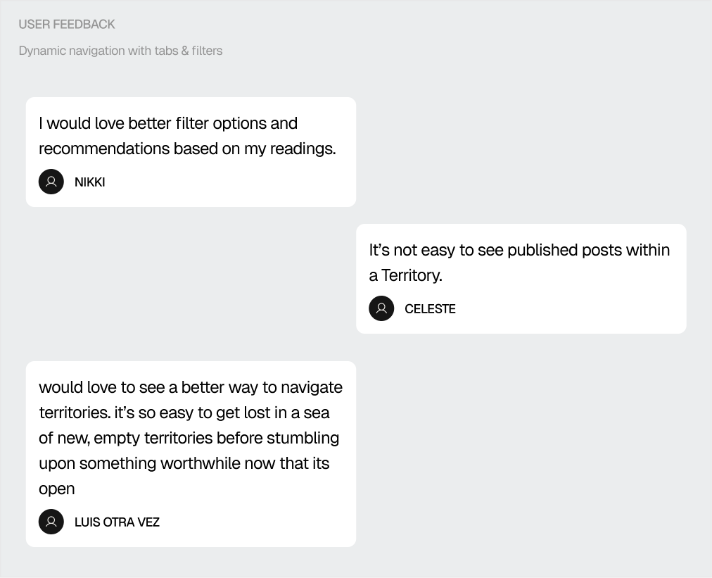
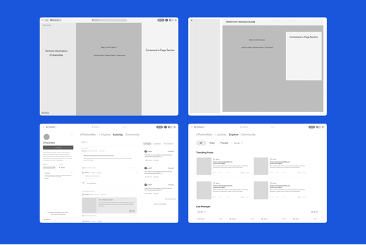
The redesign moved Territories from a single-column linear page to a flexible multi-column layout with tab-based navigation. Explore separates content discovery from Community, which surfaces membership information, active members, and admins.
The structure reduces cognitive load and creates clear pathways for different types of engagement, with room to expand as t2 grew.
The structure reduces cognitive load and creates clear pathways for different types of engagement, with room to expand as t2 grew.


OUTCOME 02
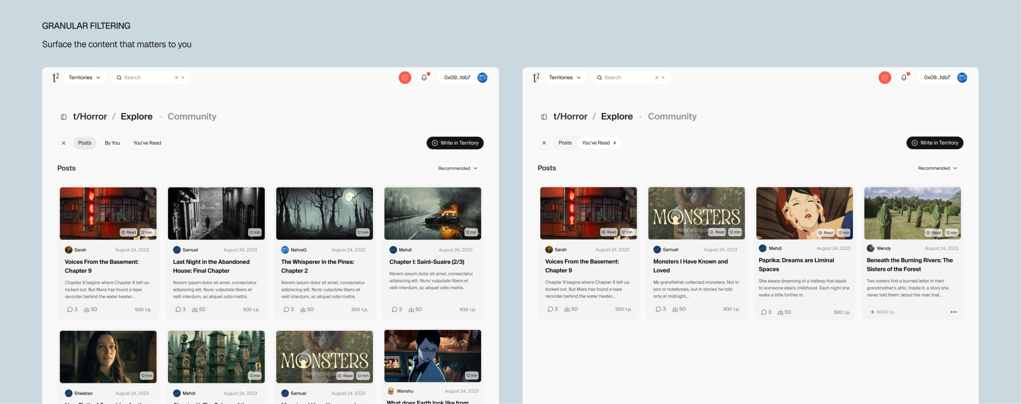
Enhanced content exploration to find exactly the type of content you're looking for
The new tab-based layout offers multiple pathways for engagement, clearly separating content exploration from community interactions. This design creates clear loops between discovering content (Explore), from community and membership features (Community)


OUTCOME 03
Breadcrumbs connecting posts, prompts, and the community space
A hierarchical breadcrumb trail, showing the relationships between a post, its source prompt, and the Territory it lives in. Users can now move between content levels confidently without losing their place.
OUTCOME 03
Territory-Content Breadcrumbs connecting posts, prompts, and the community space
A hierarchical breadcrumb trail, showing the relationships between a post, its source prompt, and the Territory it lives in. Users can now move between content levels confidently without losing their place.
OUTCOME 03
Global Territory discovery for finding communities across t2
Before, finding a new Territory meant navigating to your profile and hunting through a list. We added Territories to the global nav and introduced a dedicated Discover page, making it easy to find and join communities from anywhere in the app.

REFLECTIONS
Reflections & Impact
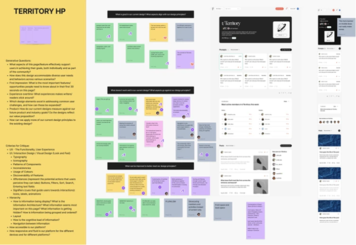
This redesign wasn't just about fixing navigation, it was one of the first times our team took a step back to define what good design looked like for t2. We ran design principle workshops together, distilling principles like Modularity and Personalization that guided every decision from the layout structure to how content cards behaved. Having that shared language made complex decisions faster and kept the work coherent across the team.
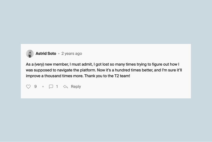
The response from users made it clear the redesign landed. Astrid Soto, a new member at the time, shared: "I got lost so many times trying to figure out how I was supposed to navigate the platform. Now it's a hundred times better."
The response from users made it clear the redesign landed. Astrid Soto, a new member at the time, shared: "I got lost so many times trying to figure out how I was supposed to navigate the platform. Now it's a hundred times better."
IMPACT
my first visit to lokal tabo in 2018
my first visit to lokal tabo in 2018
my first visit to lokal tabo in 2018